Southside Free Food Map

A comprehensive guide to FREE FOOD !

Proud to have been asked yet again by Govanhill Baths to design an essential community information leaflet !

The Southside FREE Food Map is a listings of all Food Banks, Soup kitchens, Community Meals and Community Growing groups that take place WEEKLY in the Southside of Glasgow. The generosity and "can do" attitude of these organisations gets you right in the feels ! However, the appalling fact that so many people can't afford to feed themselves is sobering. BIG LOVE to Govanhill Baths for once again responding to the needs of their Community in such a positive way x

Govanhill Bath's "FREE Food Map" - May 2017

Govanhill Bath's "FREE Food Map" - May 2017

Rags Marketing Materials

Govanhill Baths set up this social enterprise two years ago. I has taken that long for Rags to get a separate sense of self, I think we are starting to get there. After an inspired chat with B yesterday, I really got the impression that she now has a clear idea of what the project *is* rather than what it should be and that's great ! So many Enterprises start out with a big vision, wanting to do it all ... only for reality to set in when they haven't figured out who's sweeping the floor and paying for the milk ... I digress ... just lovely to see things starting to become more concrete ! Beautiful ! Anyway, here's my wee flyer that hopefully will help celebrate who Rags indeed are! flyer2R_Page_1 Watch this space for information on my "Make your own Pouffe" workshop, hopefully they will be ready for the Christmas Fair !

Alive "O"

Alive "O" is a new business, always great to start with a blank canvas ! They produce Kombucha infused with tea, it's a live pro-biotic drink which is said to have health giving properties - although I don't think I'm allowed to say that :) Based in Ireland - hence the name, taken from the Dubliners Song ! They aim to launch their product in local Food & Farmers market to which are enjoying a renaissance at the moment.

The font used is Museo, which was chosen for the distinctive V  - arms open and outstretched to the healing properties of nature. The artwork fizzes and looks refreshing much like the drinks themselves. Looking forward to Alive "O" being widely available soon, it is rather moreish !

LogoBlog1 All3

Civilization and its Discontents


Elana Herzog

Supposed to have my Mind on the Money and Money on my Mind at the moment. So why is it that I can't stop thinking about art ? Nature of Mind, wandering off into beautiful distractions on the pretext of something more substantial than job applications ! My wanderings have taken me to the wonderful insubstantiality of Elana Herzog. This piece says it all Civilization and it's Discontents.  It's all connected, it will inform my Upcyling research and exhibition somehow. 11_b_2

I rock ... apparently !

I rock It's been a long haul, with many distractions and I'm not even half way there. But the portfolio is taking shape. Whilst archiving  my work I came across possibly the best client feedback ever ! "You rock" nothing more needs said, but if you'd like to find out more about this story, check out the identity section of this blog. purdi7

Rag Tag

I am excited about this project as it is close to my heart, and to my house.

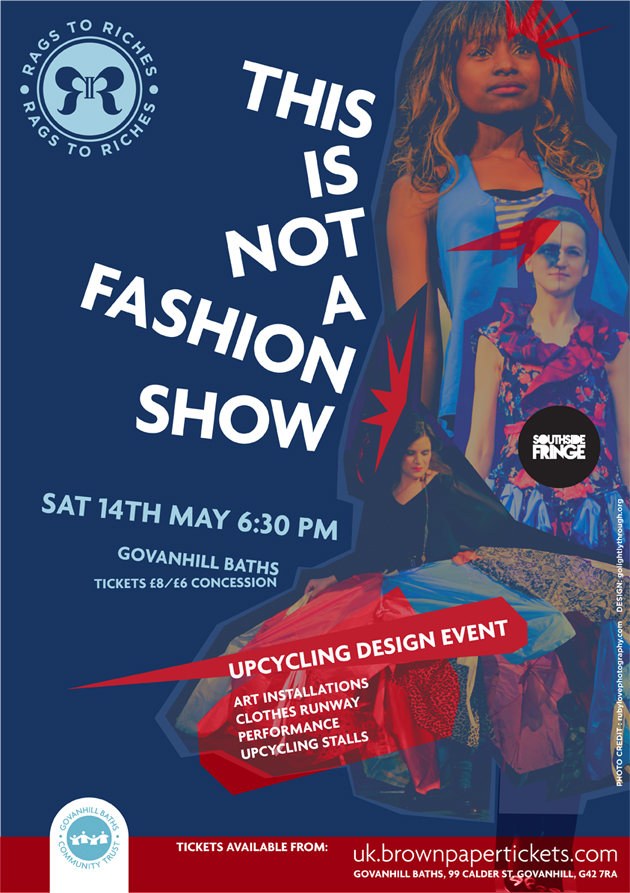
Rags to Riches will focus on the upcyling of materials handed in to the Govanhill Baths Trust Charity shop. The shop's aim was initially to reduce their amount of donations that go straight to recycling.  Instead of shredding "rags" and they aim to create new garments or household objects from the reclaimed materials. They have  now opened a separate workshop with a dedicated space for training up project participants in basic sewing skills & pattern cutting.

Walking through the door sends me all aflutter, vintage sewing patterns; shelves with fabric sorted into colours; jars of cotton thread, again colour coded;  bins of  "treasure" aka scraps! My kinda place!

Creating the "Tag"

The design solution took the Govanhill Baths Trust logo as a starting point. It was important  for them that it looked like a sister project !

To make the circle look like a button, I added a double edge. I took the R's and mirrored them to look like a bow at the centre of the button. I love that it challenges the way you view things. Two R's , a bow or a butterfly ? When looked at creatively, a rag becomes a useful resource and through a process of change the caterpillar becomes the beautiful butterfly. The post of the R is a roman numeral 2, a pun on the "to" at the centre, or can be seen as a stitch holding the button on.

The bow/ butterfly on it's own will be used as a fabric stamp. Watch this space for shop signage, fabric stamps & general brand development. I hope that this is a stamp that locals will proudly wear, marking them out as individuals who care about waste, craftsmanship & have an eye for something uniquely beautiful !

Smashing Free Fonts

Being a small enterprise and working mainly for charities - with little or no budget - means having to trawl for free stuff images and fonts mainly. Hours can pass trying to find a well designed font. The lovely people @ Smashing Magazine have taken away some of the legwork by publishing a list of top free fonts. In my humble opinion they have a very good eye ! Expect to see a modified Otama e.p element[ pictured below] featured in an identity I'm doing for the Govanhill Baths Trust.

I love a bit of 50's kitsch! Lavanderia[below] is based on the fonts used in laundrette's in the San Francisco area. The font is designed by  JAMES T. EDMONDSON  [Student at California College of the Arts in San Francisco.]  Now I have to find an excuse to use it .... mmmmm.

I can see Mosaic Leaf font below being used with one of my environmental clients. The typeface is free to use in commercial and non-commercial projects. Designed and prepared by Lukasz Kulakowski and Zbyszek Czapnik. I love the fact that the font is free but they encourage you to support them through non monetary gifts such as sweets or books. If I do get 'round to using it'll be fun thinking up an appropriate gift !

Anatomy of a Bodhi

Bodhi Eco Project is a charity with a range of activities that aim to empower us to live sustainably and harmoniously with each other and with this precious, living planet. One of their main projects is the design and build of an Eco Village.

The group's ethics & name are rooted in Buddhism. The Bodhi tree being the tree under which the historical Buddha gained enlightenment. The leaf of the Bodhi tree resembles a heart which is the key to living mindfully - it could even be said that you live heartfully. The spirals in the tree depict the "spiral path" of the Buddhist journey, but also reference celtic imagery and the fact that Bodhi are a scottish charity which was also important to the group.

The artwork was used on letterheads, business cards, reusable envelope labels, t-shirts & canvas tote bags and printed up as large banners for events. All printwork used 100% recycled paper.

Loop latest

Loop Recycling

I have been working on and off with Loop for the best part of 15 years. Together we have created everything from websites, van signage, stationery, posters, a photo journal concept, to christmas cards. Loop are great to work with, they "get design"  and understand the important role it plays in communicating their company values.

Evolving Buddhist Design

The Glasgow Buddhist Centre

I first learned to meditate @ the GBC around 20 years ago, it's therefor close to my heart ! We began our redesign around five years ago. Our initial design work was simple, bold and using only two colours. The artwork reflected a need to communicate the centre's urban environment. Images were of actual people who attended the centre and the form the design reflected the Tenement houses the centre. We created a long programme which would stand head and shoulders above all other leaflets in the display, the  cut off corner revealed a dharmachakra rising over the rooftop.

With a new Director and a pilgrimage under their belts, the centre now wanted to develop their existing design. The new artwork now became infused with reference to the "historical Buddha" and his Indian origins. The form of the programme was now a booklet;  full colour; rich imagery and had a bit of a theme. Each programme depicts an animal from the five mandalas. The Elephant represents wisdom, the Lion equanimity/enlightenment, the Horse generosity, the Peacock compassion and the Eagle fearlessness.

I look forward to the next design incarnation !

The Glad Eye from Ruby

Ruby Love Photography

I love the expression "To give someone the Glad Eye" meaning to give someone a loving look. I think this applies very well to Denise,  who set up Ruby Love Photography last year. She seems to apply her loving gaze to everything around her. Yes I've even seen her work her magic on a lamp post - setting sun, lamp post ... you get the idea !?

When we met she was unsure of what she wanted. Through a process of getting to know her unique outlook, and trying out a few mood boards & looks it quickly became clear what the final identity would look like. We took inspiration from tattoo art, a sprinkling of 50's kitsch with a contemporary finish. I love the flexibility of the design, a few colour changes or pairing with different images can create a whole new look.

Visit the Ruby Love Blog [this will open in a new window / tab]